Wednesday, May 29, 2013

Friday, May 17, 2013

Light Drawings

 For this project, we attempted a light drawing of the iconic Marilyn Monroe in her classic ballet pose. We really managed to capture the light in her facial features. However, her dress showed her legs and the her hair. Overall, the project allowed us to grow as artists and accept our mistakes.

Monday, May 13, 2013

Clay Sculptures

Here's a picture of my clay sculpture!

Painting UP!

Recently, I had the privilege of painting a landscape on a canvas! I decided to do the theme of UP, a disney movie about a house floating by balloons. This movie is my favorite movie by far, and I absolutely love the scenery. In this movie, you see 4 focal points. The calm and crisp sky that I have captured. The fluffy clouds lying beneath the house. An elaborately bright house that dangles from a massive array of balloons. In my painting, I wanted to capture every sense. The calm relaxing air with fluffy, cotton like clouds that dance upon your fingers. The smooth relaxing silence of the lone house. The soft breeze and whistle of the wind. Lastly the small taste of rain as you reach above the clouds! I captured it all through the delicate texture and colors of my painting! 

Friday, April 26, 2013

Flowers

For this project, we have created flowers! The weather is amazing and the sun is out! Flowers have bloomed at the Apex High Art One AOIT Class! Today, we have created these cute flowers to show our love for spring! This was difficult becuase it took patience. Also, you had to make it look realistic. The best part of my flower is the gradient because of the detail and precision.

Monday, April 22, 2013

Mud Rattles


So this past week, Mr. Sands wanted us to make rattles which are annoying! But I actually liked this project. To start, we had to make animals using a sculpting app on our Ipads. Sadly, I don't have a picture from my Ipad because Mr. Sands didn't take one. Enjoy this one here. With this image, we created a clay sculpture rattle. Now, they are in the kilm being heated. I think this project was pretty successful. However, I feel like I could've done better if I had my Ipad image throughout the whole time. The hardest part was giving the clay texture and wrinkles without braking it in any way. Many people may not have loved my elephant, but I love the detail I put in it. My piece was successful because I did manage to texturize it. Putting hair on my elephant didn't work at all. If I were to do this again, I would pace myself and take a picture of my own Ipad structure. Overall, I am excited to see my sculpture!

Zentangles


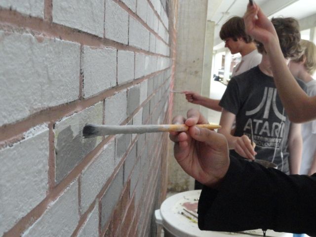
So in the recent times, we have been doing a lot with mud! Mud is sooooo gross. Mr. Sands let Samantha, Sabrina, and I just paint the wall pink. However, he didn't take a picture of it so enjoy the pictures of us helping with zentangles. It was sooo hot and we got exhausted so you can see us just chilling. Also, we halped with theses guys to make a new form of brick wall. It was successful because of the layering of paint that we used. If I was to do this project again, I would have painted the wall in a chevron pattern. Anyway, thumbs up to art! I loved zentangles! Overall, we had an amazing time enjoying the sun rays! The most difficult part was definitely detailing and reaching the high bricks on the wall!

Forced Perspective

For this portion of art class, we decided to take pictures in forced perspective.In this photo, I actually was the star and I am standing on the shed! Actually, Samantha stood on the bleachers and took a picture of me. However, it worked for forced perspective!My project was successful because of the angle of the camera. If I would've moved to the left more, the picture would have been better. The most difficult part was being directed to the correct positioning because only the photographer knows how it looks. Overall, our project looked amazing!

Tuesday, March 26, 2013

Angry Pancakes

Here is an angry pancake! This pancake is angry because spring break can't come fast enough!

Skeletons and Bubbles

 These are some of my greaest and worst works so far. My skeleton drawing, by far, was the best display of my drawing ability and art progression. You can even tell by the amount of detail and texture. With shading, I created the ribs precisely as I saw it. The first image shows how storage symbols really harm art.I think this project was the most succeassful because of my amount of detail that I put into it. You can see just how hard I tried to show an accurate drawing of Chick.
This project was the most unsuccessful because I didn't really think it though when choosing a floating object. I chose a bubble. Bubbles don't have that thick of shadows and the bubble I  chose showed  background image. This photoshop was innaccurate because it portrayed the bubble as a more concrete image rather than a clear, soapy image.

Printing Project


These past few days, we have been working on the printing project. My cow turned out really good. I completed several different animals/ prints. However, the cow was by far the best! I feel that my end procducts were very successful due to the fact that they portrayed a cow. In one of the pictures, you can see my tie-dye cow which is pretty cool. If I were to do this project over again, I would make the cow more detailed or just choose a more detail- oriented animal. The most difficult part was doing the multi color print and lining it up correctly. If lined incorrectly, the print would be off and would no longer look like a cow. It would look more like a blob. The spacing was critical.I learned the value of detail because without it, your project was dull.

Tuesday, March 12, 2013

Spray Paint Stencils


Spray Paint Stencil

Finished Product
In this project, we used our stencil reference pictures that I posted about  earlier to make a stencil to spray paint with. On the far right, you can see me using the stencil to create a spray paint picture like the finished producty on the left. Overall, I loved this project the most because it allowed us to really thing from a perspective. Even looking back on this project, the pictures look amazing. However, as we completed the project it was a true struggle.The experience was truly fun. I did incorporate some trouble with my other attempts such as the pink spray paint that caked. I love this picture because it really shows the major shapes of my face yet it looks really simple. I really learned the importance of shading and color highlighting. This project in a way is a progression from the Value Scale Kitty.

Pencil Self Portrait

In this picture, you can see how I properly spaced out my eyes. For each eye,  there is an eye in  between them. Also, you can see the proper pupil shading and the highlight. Also, I used the proper technique to make my short rounded nose. Although this is not my whole portrait, I feel like this is the best representation of my portrait. In this project, I really took time to use highlights in skin tone and also the rough colors of my hair to symbolize a very accurate portrait of myself. This project definately could've been better if I payed even more attention to detail and skin tone. Overall, this was a great project that showed the growth in the detailing of my eyes and the struggle in skin tone. I really learned the importance of shading.

Wednesday, February 20, 2013

Stencil Reference

This is the new stencil for an upcoming project in our class. With this we will spray paint the images!

Value Scale Kitty

For this project, we created value scale drawings to depict shadows. For my picture, I chose a nice picture of two kitties in a basket. In my image, I really incorporated good shading techniques and showed the angle of light. My piece was very successful.Throughout the course of the project, I learned that shading is nearly impossible with a mechanical pencil. However, my end product turned out very good. If I were to do this again, I would make some parts even darker. The most difficult part for me was focusing on the shading shapes and not the end product. Overall, my shading looks pretty good, and I feel that my drawing was successful.

Drop Shadow for Valentine's Day


My piece was very successful because it showed a full range of emotion for Valentine's Day! The wiring and creativitty really helped make the piece original and cute! If I were to do this [rpject again, I would definately add people to the shadow. The most difficult part was being able to fit in every detail. It was difficult to really find what you were looking for. I learned how shadows contribute to your view. Also, I learned that shadows aren't specific, but an overall outline.

Thursday, February 7, 2013

Reducing an image's levels

For the reducing of an image's color schemes, I decided to choose a Lilly Pullitzer pattern because they are full of great color and details. For this project, we will be making mud paintings of our pictures. Using photoshop, we created new image levels for colorful photots. For me, the saturation looks best. However, I had a hard time making sure my details stayed as I edit my photo. I love my photo because it is a good example of how hard work pays off.

The floating bubbles

For this portion of class, we created a floating photoshop. For my example, I chose a bubble. On the right, you can see the original image with no shadow or opacity; allowing for a great comparison. On the left, you can see a great picture of a photoshop done. The shadow allows a more accurate view of a floating bubble. The bubble to the right, however, demonstrates a bubble without a shadow, or a true opacity. I think that my work on this bubble, shows a good example of computer art skills. The best thing I did was the drop shadow. During this portion of class, the cropping was the hardest part, considering my picture was naturally large.

Monday, February 4, 2013

Rhino in Field

 In class, we have learned how to use the tools of photoshop and move our rhino out of the jungle. To start, we were given an image of a rhino amoung antelopes in it's grazing land. We used photoshop to crop of the grass and other wildlife. Being creative, I decided to put my rhino in a poppy field to show a contrast in color. I did a great job of cropping the grass and making the image believable in every way. By making the rhino smaller, it is harder to view possible photoshop mistakes. Overall, I think I did a great job of making a believable photoshop that portrays a new visual image.

Skeleton Drawings

Throughout the course of this semster, we have been learning about drawing. On the first day of school, I drew the skeleton to the left using stored symbols. This drawing was very small and wasn't a good portrayal of the skeleton. With the same amount of time and a few days later, I progressed to the skeleton on the right. In my opinion, this final piece really paid attention to detail and portrayed an accurate view of the skeleton. I feel like my second piece was more successful because I really thought about every single aspect of the particular skeleton. What really helped enhance my art was the shading along the ribs and the analysis of the different metal attachments and marks on the skeleton. On the left, you can see that a drawing based on stored symbols is much less productive. If I were to do this project over again, I would pay even more addition to detail. The most difficult part was really taking my time. From this piece, I learned to not rely on the stored symbols in my mind and to actually analyze the piece that I am illustrating.

Friday, January 25, 2013

Bunny-Puppy Bones

My newimal, here, shows the primary bones. Starting with the ears, I higlighted the small bones overlapped by cartilige in the ear precisely for a fully functionable ear. Also, I highlighted the ribs with shading to simulate curvature around major organs.This newimal also has a spinal cord with vertabraes. Also, I highlighted the pelvis/ hip area with a butterfly curve.